Diverging Approach: Kaizen

While I was working at the state, they had me sit in on an internal seminar series about kaizen, or the Japanese business philosophy of continuous improvement. For me, the process came somewhat naturally: as long-time readers of this blog are no doubt aware, continual reassessment of existing conditions and trying to find more effective and more efficient ways to get things done are a regular topic of conversation in Diverging Approach blog postings.

Of course, continual improvement is something that I also like to do in my personal life as well, which means we’re going back to the map. Our Metra map has gone through several iterations in the past, and while this year’s version of the map is stylistically similar to the most recent version, I’ve gone ahead and — based on Metra’s reduction/simplification of services during the pandemic — restructured how the various lines and stopping patterns are identified from the ground up.

Grab the PDF to zoom in (or to print it out yourself at home).

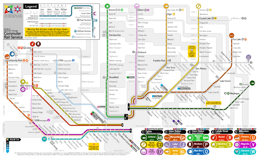
If there’s a silver lining to the pandemic, it’s that Metra has committed to being open to significant changes in their schedules to make them easier to understand and to remember, which we’re already starting to see in the latest version of the previously-notoriously-complex Union Pacific North line schedule. The Metra Electric suburban express zone consolidation from three express zones to two also simplified the schedule, as well as the BNSF Line going to a reduced two-track schedule.

Here’s a crash course in how this map works:

  • Each line is identified by a color, a logo, a unique name, and letters to indicate simplified stopping patterns. Metra’s existing line naming process — based largely on legacy (or present) railroad companies is not intuitive for new riders and can occasionally be confusing even for long-time customers. This map simplifies all that and presents the same data in different ways, since everyone processes information in different ways and an all-of-the-above approach can reduce barriers to entry for new and infrequent riders. Lettered services generally run alphabetically from north to south, with “A” trains to Kenosha and “W” trains to 93rd/South Chicago, with groups of letters departing from the same downtown terminal: A-F trains use Ogilvie; G-Q trains use Union Station; R and S trains use LaSalle Street Station; and U-W trains use Millennium Station. (This system is also forward-compatible with moving SouthWest Service (Q) trains to LaSalle Street Station, as well as for future SouthEast Service (T) trains using LaSalle Street Station.)
  • Line colors and “boldness” indicate how frequently service operates. The more a train line looks like a transit line on a CTA map, the more frequently trains run. As the colors wash out, trains run less frequently: outlying stations with decreased frequency are shown as thinner lines (like UP-N north of Waukegan and MD-W west of Elgin); weekday-only lines are less colorful (see the weekday-only SWS); and peak-only services are shown more faintly as white and gray lines that fade into the background (see the HC, NCS, and express services).
  • Similarly, colors of the “roundels” used for trains also indicate service frequency. The full-color roundels show trains that run the most frequently; gray roundels indicate trains that only run during peak periods, and the “outline” roundels indicate more limited extended services that do not run as frequently for either peak or off-peak trips.
  • Letters refer to different stopping patterns. Ideally, letters could be used to identify trains themselves (e.g., “This is an R train to Joliet” or “This train will make all scheduled M, N, and O stops to Aurora”). New in this version is an expansion of the “combined service” local model on the Rock Island (RS) and Metra Electric (UV) lines systemwide, with two- (or three-) lettered trains on most lines indicating local services that more intuitively assigns stations to “service zones”: for instance, at Itasca — a “K” station — both (K) express trains and (KL) local trains serve the station.
  • The shape of the background of a lettered route indicates a deviation from the normal stopping pattern. Taking a page out of the New York City Subway system’s design manual, stopping patterns shown as a diamond rather than a circle indicate a limited-stop express train within that service zone (e.g., <U> trains only serve Homewood-University Park rather than the full Kensington-University Park (U) zone). Likewise, short-turn trains that don’t make all stops in the service zone — usually the counterpart to the diamond trains — are shown as a square (so [U] trains serve the Kensington-Homewood stations the <U> trains bypass). Also, as shown above, these shapes translate well into normal type, using parentheses for circles, angle brackets for diamonds, and square brackets for squares.
  • The map itself is formatted to be printed at home, formatted for legal-size (8.5″ x 14″) paper. In the near future I’d like to make a version of this map that isn’t constricted by the size of a page, but for now this page size matches our four-fold Travel Guides, which will be updated next summer hopefully after the dust settles from the pandemic. It’s also easier for anyone interested to print at home, if they so like.

Our unique line naming system is back, too: each line is named after a passenger train that previously operated on all or part of the line, but without directly referring to the heritage (or current) operator, which often leads to confusion, like how there are three “Union” lines that do not actually serve Union Station, or how there are two North Lines, two West Lines, and both a Northwest Line and a North Central line, the latter of which shouldn’t be confused with the old Illinois Central lines, which run in a totally opposite direction… and so on. Like before, each line has its own logo (and here’s your annual reminder that I’m not the best graphic designer out there), and each line also has a corresponding standard-issue emoji, because this is the 21st Century, after all.

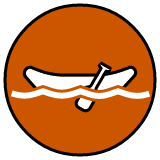
Ashland Line (Union Pacific North) 🎣
History: The Ashland Limited was a Chicago & North Western train to Lake Superior. Also known as the Fisherman’s Special, hence the logo and emoji of a fish on a hook.
Services: (A) weekday peak express trains to Waukegan, (B) weekday peak local trains to Highland Park, (AB) daily trains to Waukegan with continuing service to Kenosha, <B> special event outbound trains to Ravinia Park

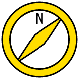
North Western Line (Union Pacific Northwest) 🧭
History: The North Western Limited was a Chicago & North Western train to the Twin Cities. The line is also known as the Northwest Line, it follows Northwest Highway, etc.
Services: (C) peak express trains to McHenry (weekdays) or Crystal Lake (daily), with continuing service to Harvard; (D) daily peak local trains to Des Plaines (weekdays) or Arlington Heights (weekends); (CD) daily local trains to Crystal Lake with continuing service to Harvard

Kate Shelley Line (Union Pacific West) 🌩
History: The Kate Shelley 400 was a Chicago & North Western train to Iowa. Kate Shelley was an American railroad heroine who prevented a train crash after a bridge washout during a storm, hence the thunderbolt logo and emoji.
Services: (E) weekday peak express trains to Elburn, (F) weekday peak local trains to Elmhurst, (EF) daily local trains to Elburn

Marquette Line (Milwaukee North) 🛶
History: The Marquette was a Milwaukee Road train to Iowa, via Madison. Named for an early Midwestern explorer, the logo and emoji is a canoe.
Services: (G) weekday peak express trains to Fox Lake (with differing stopping patterns between AM and PM peaks), (H) weekday peak local trains to Lake Forest, (GH) daily local trains to Fox Lake

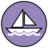
Laker Line (North Central Service) ⛵
History: The Laker was a Soo Line train to Duluth. The North Central Service operates over the former Soo Line, which is now owned by Canadian National. Logo and emoji of a sailboat.
Services: one round-trip peak (J) local train to Antioch each weekday, one <J> express round-trip peak train to Antioch each weekday

Arrow Line (Milwaukee West) 🏹
History: The Arrow was a Milwaukee Road train to Omaha. The logo is an arrowhead facing west; the emoji is a bow and arrow.
Services: (K) weekday peak express trains to Big Timber Road, (L) weekday peak local trains to Franklin Park, (KL) daily local trains to Elgin with extended weekday service to Big Timber Road

Western Star Line (BNSF Railway) ⭐
History: The Western Star was a Great Northern train to the Pacific Northwest that locally ran on the Chicago, Burlington & Quincy (a predecessor of the BNSF Railway). Logo and emoji is a star.
Services: (M) weekday peak express trains to Aurora; (N) weekday peak express trains to Fairview Avenue; (O) weekday peak local trains to Brookfield; (MNO) daily local trains to Aurora. Some combined (MN) express trains also operate during weekday peak.

Abraham Line (Heritage Corridor) 🎩
History: The Abraham Lincoln was an Alton Railroad train to St. Louis that continues in modern times as Amtrak’s Lincoln Service. Logo and emoji is a formal hat.
Services: two round-trip (P) local trains to Joliet each weekday

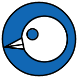
Blue Bird Line (SouthWest Service) 🔵🐦
History: The Blue Bird was the Wabash Railroad’s train to St. Louis that operated on the present SouthWest Service tracks. Logo and iOS emoji is a bird’s head; on Android, a two-part blue circle and the default bird is used.
Services: (Q) weekday local trains to 179th/Orland Park with continuing peak service to Manhattan; one round-trip <Q> express train each weekday

Rocket Line (Rock Island) 🚀
History: The Rockets were the Rock Island’s signature passenger trains that criss-crossed the Midwest. Logo and emoji is a rocket.
Services: (R) daily express trains to Joliet; (RS) daily local trains to Joliet via the Suburban Line (see below)

Suburban Line (Rock Island) 🏠
History: The Suburban Branch is the long-time name of the local Rock Island line through Morgan Park and Beverly. Logo and emoji is a single-family house.
Services: (S) daily local trains to Blue Island; (RS) daily local trains continuing to Joliet

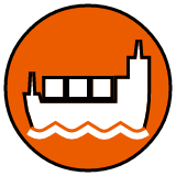
Panama Line (Metra Electric) 🚢
History: The Panama Limited was a legendary Illinois Central passenger train to New Orleans, named after the Panama Canal. Logo and emoji is a container ship.
Services: (U) weekday express trains to University Park; <U> weekday peak limited-stop express trains to University Park; [U] weekday peak short-turn express trains to Homewood; (UV) daily local trains to University Park (see below)

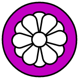
Magnolia Line (Metra Electric) 🌸
History: For a little over a year, the Illinois Central added some standard coaches to the Panama Limited; not wishing to sully the prestige of the Panama Limited name, the IC designated the coaches as a separate “train” called the Magnolia Star. The logo is a simplified magnolia blossom, and the emoji uses a flower.
Services: Prior to the pandemic, (V) local trains made all stops to 115th/Kensington; currently, that particular service pattern no longer exists. However, (V) extended local service to Blue Island and <V> weekday peak express service to Blue Island continue to operate, with (UV) local service operating north of Kensington daily.

Diamond Line (Metra Electric) 💎
History: The Green Diamond was Illinois Central’s train between Chicago and St. Louis. The logo and emoji is a diamond-like gem.
Services: ( W ) daily local trains to 93rd/South Chicago, with <W> weekday peak express trains to 93rd/South Chicago


Click here to download the full PDF, which can be printed at home on 8.5″ x 14″ paper.

The Yard Social Club Metra Map

Editor’s Note (Nov 26, 2020): A new version of our map is now available with more details here. This page will be updated accordingly in the near future.


Nothing Metra does can be easy, and their line nomenclature fits right in. Metra operates a legacy network of commuter rail service, and as such most of their lines are named after their host (or former host) railroads. While this serves as a semi-interesting history lesson, it makes for a network that is less than intuitive for infrequent riders.

Metra’s official map is… well, it’s fine. Metra’s online map offerings are more robust, with a GIS base so you can zoom in, click around, and even see individual trains in real-time when you look on a per-line basis.

Metra’s official map, as seen at Chicago Union Station in June 2018.

I had two primary concerns with Metra’s map. First and foremost, it can be confusing — but granted, most of the confusion comes from the line names Metra chooses to use. (More on that in a bit.) But the other issue is that the map makes no effort to delineate service frequency and chooses to focus on regional coverage instead. That’s fine for peak periods (where, admittedly, the lion’s share of Metra’s ridership uses the system anyway), but from the map it’s impossible to know that two of the above Metra lines have no weekend service whatsoever, with another line offering very limited Saturday service and no Sunday service. And then there are the branch lines, which may also have much more limited service. (Or, in the case of the South Chicago or Beverly/Morgan Park branches, they may not.)

You see where this is heading.

Since I can’t leave well-enough alone, I developed my own map and naming scheme for the Metra system. It goes without saying that some of the more creative aspects of this plan are used exclusively on this website, so don’t go asking Metra staff where the Arrow Line is or anything like that. But I may occasionally use our short-hand around Diverging Approach and in our Weekend Guides.

Click the map for a larger view of the JPG. Or click here to see the map as a PDF.

The map, which is formatted to 11″x17″, was conceived as a flower floating on the shore of Lake Michigan. The map otherwise mostly throws local geography out the window, although care was taken to make sure that the respective lines cross in the right places and that the downtown terminals are positioned somewhat correctly relative to each other.

From there, the lines and stations are drawn based on service frequency: generally, the more a line and station looks like the lines and stations on the CTA map, with bold lines and white circles at the stations, the more Metra service that location gets. (Note for the uninitiated: Metra’s off-peak service is nowhere near as frequent as the CTA. The highest frequency we show on our map is “Core Service”, which means service no worse than once every two hours off-peak. That’s also why we used the word “Core” instead of “Good” or “Full” or “Standard”, because any of those terms should be used for off-peak service that’s, you know, good.) As the frequency and/or days of service decrease, the lines get lighter and the stations blend in more with the line behind it, until peak-only services are shown only as light gray dots on a barely-there white line. Our map also looks at what we called “extended service”, where certain trains continue further out into the hinterland at lower frequencies. On the map, these are shown as narrower lines, which indicate that those stations still get service as shown on the map, but not at the same frequency as stations closer to the urban core.

With a hat-tip to the New York City Subway system, I initially developed our naming scheme first based on a lettering system to differentiate Metra from the CTA’s rail lines (which are color-coded) and the CTA and Pace bus networks (which are numbered). Generally, Metra lines are lettered increasing in a counter-clockwise manner from north to south, with groups of letters based out of the four/five downtown rail terminals. I subdivided Union Station into a North Concourse and a South Concourse, based on the raw number of trains that leave Union Station relative to the other terminals. I also divided the Rock Island into two separate lines and the Metra Electric into three separate lines, which I feel more accurately indicates the services offered.

For lines that offer express services during peak periods, the line may have a secondary letter as well. Peak-only supplemental services are identified on our map with either the secondary letter in a diamond (to show express trains) or the primary letter in a square (to show “short-turn” local trains). Generally speaking, all local trains will use the primary letter, and all express trains will use the secondary letter. Since all Metra trains are numbered relatively consistently (outbound trains are odd numbers; inbound trains are even) One of the perks of a lettering system is that individual trains can easily be referred to as a combination of the line letter and train number, which even inline in text can immediately tell the reader basic information about the train in question (e.g., train K2215 is an outbound MD-W train; train R417 is an outbound RI train that does not serve Beverly and Morgan Park).

Let’s be honest: the map is still very confusing, and it’s worth noting that I’m not an expert cartographer. However, that’s also kind of the point of the entire exercise. One of Metra’s biggest strengths in the region also happens to be one of it’s biggest weaknesses: branding itself as a single, cohesive regional network, when in reality each line has it’s own quirks in how service is delivered.

In the most recent update, I also had a little extra fun and refined our suggested proper names for each line as well. Originally, the map referred to trains as “Corridors” that paralleled a major highway heading towards downtown Chicago. That old system had plenty of flaws: the Old Guard wasn’t a fan that we divorced some railroad history from the rail lines, and the Urbanists weren’t terribly happy that we contextualized transit services in terms of highways. (And there were a few difficult choices that had to be made, like having no “Eisenhower Corridor” since both the UP-W and BNSF do the job.) Instead, I put my thinking cap on, dug through the Internet, and came up with something totally unique: names based on former long-distance passenger trains that previously served the line in some way, shape, or form. This had a few benefits:

  • It’s simple. Each line has an easy-to-remember one- or two-word name.
  • It honors the past. As a rule, Diverging Approach tries to nudge Metra forward into the future, not backwards into the past, but Chicago’s rich railroad history deserves to be celebrated.
  • It strikes a balance between the two. One of the biggest critiques of the current Metra naming system is that it’s not terribly intuitive for new riders, and looking at the system as a whole can be way too easy to confuse. For instance: there are two North Lines, two West Lines, and a Northwest Line; there are three lines with “Union” in the name and none of them go to Union Station; the Rock Island and Metra Electric lines can each be better thought of as multiple, coordinated services; there’s dangers of forced future name changes if more railroad consolidation in the market occurs; and so on. Our naming system gets rid of all that and modernizes the system, but still connects back to the original railroads who built the network.
  • It’s fun. To make things easier to remember and identify, the new naming system also includes individual icons for each line. And better yet, each icon has a corresponding standard-issue emoji for smartphone users because, hey, why not?

Below is a list of our reimagined names (and letters and icons and emojis) for each Metra line.

The Ashland Line
Union Pacific North
(A) Daily core service to Waukegan with extended service to Kenosha
<B> Weekend outbound express trains to Ravinia Park for events

  • History: The Ashland Limited was a Chicago and North Western train from Chicago to Ashland, Wisconsin, via Green Bay. I was tempted to go with the Flambeau, another C&NW train that used what’s now the North Line, but as a true blue Chicagoan I couldn’t in good conscience go with a name so similar to “Lambeau” on the only line that goes into Wisconsin and has a forest green color scheme to boot. (The forest green color Metra uses is officially “Flambeau Green”. You’ll see I overlapped a few of these line names with Metra’s throwback color names, so I’m hoping that could be a foot in the door to actually making some of these changes.) Plus, the corridor parallels Ashland Avenue pretty closely in the city, so that’s good enough for me.
  • Line Icon: A fish, being fished. (The Ashland Limited was also occasionally referred to as the Fisherman’s Special or the Northwoods Fisherman.)
  • Emoji: 🎣

The North Western Line
Union Pacific Northwest
(C) Daily core service to Crystal Lake and extended service to Harvard
<D> Peak period express service to Harvard or McHenry

  • History: The North Western Limited was the Chicago and North Western’s primary train between Minneapolis-St. Paul and Chicago before the streamlined 400s were used. This one could have also been called “The Viking Line” for the C&NW’s Viking; Metra uses “Viking Yellow” for the color. Honestly, I’m playing a little fast and loose with this one: the North Western Limited used today’s North Line up to Milwaukee before heading to the Twin Cities, but considering it’s currently the Northwest Line that parallels Northwest Highway and used to be operated by the Chicago and North Western, let’s keep this one simple. (And it did operate over the current UP-NW’s tracks between Ogilvie and Clybourn, after all.)
  • Line Icon: A compass. (And yes the compass is pointing in the correct direction: since the needle always points north, if you’re heading northwest, this is what the compass should look like.)
  • Emoji: 🧭

The Kate Shelley Line
Union Pacific West
(E) Daily core service to Elburn
<F> Peak period express service to Elburn

  • History: Kate Shelley has a prominent place in railroad folklore. An Irish immigrant living in Iowa in 1881, she overheard a C&NW inspection locomotive wreck into Honey Creek following a bridge washout during a round of severe thunderstorms. Since a passenger train was due through the area later that night, Kate ran through the storm to a nearby train station to alert railroad staff of the wreck. Her quick thinking saved the passenger train as well as two of the crew members from the initial wreck. C&NW would later run the Kate Shelley 400 over what’s now the Union Pacific West Line between Chicago and Iowa. It’s never a bad time to celebrate another brave woman in Midwestern history. (Plus Metra already officially uses “Kate Shelley Rose” as the color for the line.)
  • Line Icon: A thunderstorm.
  • Emoji: 🌩

The Marquette Line
Milwaukee North
(G) Daily core service to Fox Lake
<H> Peak period express service to Fox Lake and weekday evening reverse commute express service from Antioch

  • History: The Milwaukee Road ran the Marquette from Chicago to Madison and points west over what’s now the Milwaukee North (before the Illinois Tollway effectively killed demand for passenger rail service into Wisconsin).
  • Line Icon: In honor of early Midwestern explorer Father Jacques Marquette, who cut through what’s now Chicago in 1673, this line uses a canoe.
  • Emoji: 🛶

The Laker Line
North Central Service
(J) Weekday basic service to Antioch

  • History: Metra’s service now operates over tracks controlled by Canadian National, but way back when, the Soo Line operated The Laker between Chicago and Duluth over this corridor (north of Franklin Park). Interestingly enough, the line between Franklin Park and downtown swung south and paralleled what’s now the Blue Line in Oak Park and Forest Park, which makes a fun corridor to discuss in the context of the O’Hare Express. “The Laker” is also a good name for this corridor since it cuts right up through the center of Lake County.
  • Line Icon: A sailboat. Maybe on the nearby Chain O’Lakes.
  • Emoji: ⛵️

The Arrow Line
Milwaukee West
(K) Daily core service to Elgin with weekday extended service to Big Timber Rd
(L) Peak period express service to Big Timber Rd

  • History: The Arrow was the Milwaukee Road’s Chicago-to-Omaha train, which operated over what’s now the Milwaukee West corridor. Metra calls the color “Arrow Yellow” after the train, but personally I feel like “yellow” is a bit misleading.
  • Line Icon: I used a stylized arrowhead, pointing left (west) as a hat-tip to the current Milwaukee West name.
  • Emoji: There’s no direct arrowhead emoji and I feel like one of the standard arrows is a little too, uh, direct… but there is a bow-and-arrow, so whatever, close enough. 🏹

The Western Star Line
BNSF Railway
<M> Mon-Sat peak express service to Aurora
(N) Daily core service to Aurora
<O> Weekday peak express service to Fairview Avenue

  • History: I really, really wanted to use the Zephyr here; the last version of the map that I posted in the last blog post still had the Zephyr listed. But, since this line does serve Union Station, and since Amtrak runs both the California Zephyr and the Illinois Zephyr over this same route, I unfortunately decided that it’d be too easy to confuse. I also considered the Mainstreeter, which is just a cool name for a train plus would be pretty representative of the small towns served by this Metra service, but I opted against it since there’s literally a “Main Street” station on this line (as well as one on a different line). That left the Western Star, a Burlington/Great Northern train that connected Chicago to Spokane via Glacier National Park. Plus, hey, a Star Line!
  • Line Icon: Not Luxo. But close.
  • Emoji: ⭐️

The Abraham Line
Heritage Corridor
(P) Peak period express service to Joliet

  • History: It’s nice when history is still current. The Alton Railroad began the Abraham Lincoln in 1935, and since then the operators have changed (from Alton to Gulf, Mobile and Ohio, and on to Amtrak) but the long-distance train keeps rolling today as Amtrak’s Lincoln Service. To distance the Metra line from the Amtrak service, I kept the Abraham and dropped the Lincoln.
  • Line Icon: Lincoln’s trademark stovepipe hat. If regular Heritage Corridor riders prefer to see it as a tombstone, hey, go for it.
  • Emoji: 🎩

The Blue Bird Line
SouthWest Service
(Q) Weekday core service to 179th St with peak period extended service to Manhattan and very limited Saturday service to Manhattan

  • History: The Wabash Railroad originally ran the Blue Bird (and the Banner Blue, which Metra uses as the color of the line) between Chicago and St. Louis via Decatur. If only the Wabash ran the awesomely named Cannon Ball over this route instead.
  • Line Icon: It’s a bird’s head. Or at least it’s supposed to be a bird’s head. I’m not good with animals.
  • Emoji: Another iPhone/Android conflict here: Apple’s bird emoji is actually blue (doesn’t look too dissimilar from my icon, actually); other emoji libraries use a bird that looks more like a cardinal here. When in doubt, add the blue ball in front. 🔵 🐦

The Rocket Line
Rock Island – Main Line
(R) Daily core service to Joliet via Blue Island
(RS) Daily off-peak core local service to Joliet via Suburban Line

  • History: When Amtrak was first formed in 1971, the government offered railroads a simple deal: pay a small fee and/or give Amtrak your passenger rolling stock to let Amtrak run passenger service, and in return the freight railroads would no longer be on the hook for providing (money-losing) passenger service. The Rock Island was one of six railroads that opted out of joining Amtrak, continuing to run their famed Rocket trains into the 1970s. In Chicago, the Peoria Rocket and the Des Moines Rocket (later the Quad Cities Rocket) operated over the Rock’s tracks between downtown and Joliet.
  • Line Icon: A rocket, theoretically flying north-northeast from Blue Island to LaSalle Street Station.
  • Emoji: 🚀

The Suburban Line
Rock Island – Suburban Branch
(S) Daily core service to Blue Island via Beverly/Morgan Park
(RS) Daily off-peak core local service to Joliet via Beverly/Morgan Park

  • History: Another freebie, the Suburban Line has been known as the Suburban Line (or Suburban Branch, depending on the source) since before the Great Chicago Fire. Since in our lettering scheme the Rock’s Rockets are R trains and the Suburbans are S trains, no need to get too deep in the weeds here.
  • Line Icon: A single-family house. Picket fence and 2.3 kids not included.
  • Emoji: 🏠

The Panama Line
Metra Electric – Suburban Main
(U) Mon-Sat core express service to University Park
(UV) Daily off-peak core local service to University Park

  • History: The most famous Illinois Central train that doesn’t have a song written about it, the Panama Limited was one of the most luxurious trains in the country, connecting Chicago and New Orleans over the Illinois Central’s main line. The original train was named after the Panama Canal, which was still being constructed when service first started.
  • Line Icon: Since the train was named after the Panama Canal, the icon is a (very crude) container ship.
  • Emoji: 🚢

The Magnolia Line
Metra Electric – City Main/Blue Island Branch
(V) Daily core service to Kensington/115th St with Mon-Sat extended service to Blue Island
(UV) Daily off-peak core local service to University Park

  • History: The Panama Limited was one of the most luxurious trains in the country, with an all-sleeper consist. In 1967, as the Panama Limited was losing ridership (along with just about every other passenger train in the nation), the Illinois Central threw a few coach cars onto the Panama Limited and briefly called the coach accommodations the Magnolia Star, probably to try not to sully the luxurious reputation of the Panama Limited. I wonder if there’s some sort of allegory in there for how Metra treats suburban riders vs. city riders…
  • Line Icon: A simplified magnolia bloom.
  • Emoji: 🌺

The Diamond Line
Metra Electric – South Chicago Branch
(W) Daily core service to South Chicago/93rd St

  • History: The Diamond represents a few different Illinois Central trains, including the Green Diamond, the Diamond Special, and the Night Diamond between Chicago and St. Louis. While the South Chicago Branch never hosted long-distance trains (for obvious reasons), these trains still share the old Illinois Central main line into downtown north of 63rd Street.
  • Line Icon: A basic diamond on a teal background.
  • Emoji: 💎