
Editor’s Note #2: The latest and greatest (May 2019) version of the map is here. This post is maintained for posterity.
Editor’s Note: In June 2018 we released an updated version of our map, which can be viewed here.
This weekend, an old post‘s web traffic spiked thanks to some people sharing this site on Twitter. As some of you know by now, I created my own version of Metra’s system map for our use here at The Yard Social Club; and as many of you have pointed out, it’s confusing as hell. But that was also kind of the point: Metra’s system and schedules are incredibly complex, and trying to pin down what a transit map of one of America’s largest commuter rail networks would look like was a challenge. As Daniel Kay Hertz pointed out in his tweet, our map tries to show 53 different service patterns as straightforward as possible, although even that is understating the complexity: there are plenty of trains that make (or don’t make) particular stops while otherwise largely conforming to the system I came up with. And I really didn’t even bother trying to decipher the UP-N line, which any casual commuter would definitely need a timetable to fully understand since the trains don’t seem to follow any particular pattern. If you made each particular stopping pattern its own designation, you’d easily get into the hundreds.
This is because Metra says they run a railroad rather than a transit system. The commodity they haul tends to be commuters and travelers, but otherwise the historic railroad mentality is still there. Trains run per the timetable, full stop. Whether the timetable makes any sense or makes commuter rail more attractive to infrequent users is besides the point: the train runs when the train runs, get on it or don’t. The entire point of this blog is to try to nudge Metra into doing little things that would make the system more attractive to casual users without totally reinventing the steel wheel, and there will undoubtedly be future blog posts about this as well.
But in the meantime, to the map.
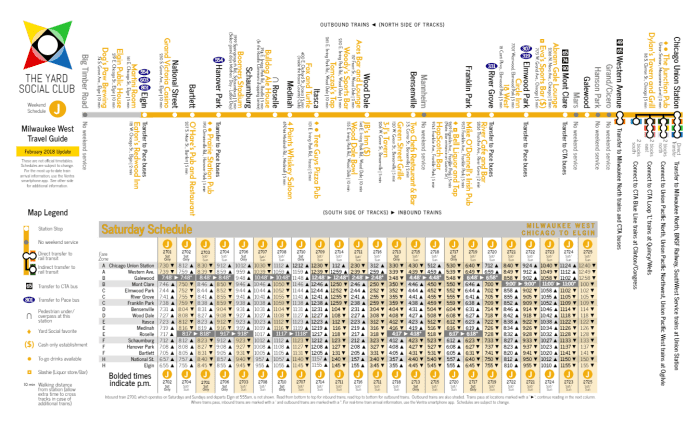
While the focus and the primary visual focus is on the lettering scheme, there’s more here than meets the eye. As a Facebook commenter noted:
You know, initially I wanted to make a snarky remark that your map looked like someone read Vignelli’s [landmark New York City] subway map and did away with the useful cleanliness and vomited symbols onto it, but after staring at it for a few minutes it’s actually really useful in describing the multitude of short-turns and limited services.
But buried in the legend of the map is what I think is the most useful change: changing the long name of each line away from the legacy/host railroads and into something different. The legacy/host railroad naming scheme made more sense when the RTA first formed Metra back in the early 1980s, but thirty-odd years later it leaves us with a system that’s just that much more difficult to understand unless you’re a daily commuter. For instance, today Metra has two North Lines, two West Lines, a Northwest Line, and a North Central line (which is officially named a “Service” rather than a “Line”). The Union Pacific lines don’t serve Union Station. The Heritage Corridor is named after a canal. The Metra Electric line has three distinct branches.
We can do better.
When I created The Yard Social Club’s map, in addition to the lettering scheme, I came up with ten corridor names as well. (I folded the North Central Service mostly into the Milwaukee West line, for reasons to be explained later.) In my scheme, I named the lines after a parallel road or freeway that would be used to drive into Chicago if you didn’t take the train: if you would usually drive downtown on the Edens, the Edens Corridor trains would probably be a good alternative. If you live along Ogden Avenue, the Ogden Corridor train is nearby. Of course, this system still isn’t foolproof since roads don’t necessarily parallel the rails, but by and large it works. Wherever possible I tried to use a parallel freeway corridor (so the UP-NW is the Kennedy Corridor rather than the Northwest [Highway] Corridor), with the exception of the Eisenhower since both the UP-W and BNSF lines relieve the Ike.
So here’s how it shakes out, with the lettering scheme as well:
- A/B – Sheridan Corridor ServiceA: Union Pacific North Line trains to Kenosha
-
- B: Union Pacific North Line trains to Waukegan
- C/D – Kennedy Corridor ServiceC: Union Pacific Northwest Line trains to Harvard
-
- D: Union Pacific Northwest Line trains to McHenry
- E – Roosevelt Corridor ServiceE: Union Pacific West Line trains to Elburn
- F – Reserved for future use
- G/H – Edens Corridor ServiceG: Milwaukee North Line trains to Fox Lake
-
- H: North Central Service trains to Antioch via Libertyville
- I/J/K – Grand Corridor ServiceI: North Central Service trains to Antioch via O’Hare
-
- J: Milwaukee West Line trains to Elgin
- K: Milwaukee West Line trains to Big Timber Road
- L – Stevenson Corridor ServiceL: Heritage Corridor trains to Joliet via Lemont
- M/N/O/P – Ogden Corridor ServiceM: BNSF Railway express service, Aurora-Lisle-Downers Grove
-
- N: BNSF Railway local service to Aurora and express service to Naperville-Route 59
- O: BNSF Railway express service, Fairview Avenue-Hinsdale
- P: BNSF Railway local service to Brookfield and express service to Highlands-Congress Park
- Q – Southwest Corridor ServiceQ: SouthWest Service trains to Manhattan
- R/S – Dan Ryan Corridor ServiceR: Rock Island trains to Joliet via Vincennes Avenue
-
- S: Rock Island trains to Joliet via Beverly/Morgan Park
- T: Reserved for future use
- U/V/W/X/Y/Z – Lake Shore Corridor ServiceU: Metra Electric trains (express and local) to University Park
-
- V: Metra Electric trains to Blue Island via Hyde Park
- W: Metra Electric trains to South Chicago via Hyde Park
- X: Metra Electric express service, Kensington-Harvey
- Y: Metra Electric express service, Hazel Crest-Flossmoor
- Z: Metra Electric express service, Olympia Fields-University Park

The lettering system generally increases in a counterclockwise direction from north to south with a focus on consolidating adjacently-lettered lines into the same terminals. Extra care was taken for future flexibility: “F” is reserved for either a Milwaukee North branch extension (in which case the branch west of Rondout would change to form a useful mnemonic – “F” to Fox Lake, “G” to Gurnee) or a different stopping format on the Union Pacific West Line, which is currently completing a full third track and could conceivably host service as robust as the BNSF. When the CREATE 75th Street Corridor Improvement Plan happens and SouthWest Service trains begin terminating at LaSalle Street, the lettering scheme still holds (with LaSalle hosting Q/R/S trains). “T” trains are reserved for a potential SouthEast Service, which occasionally is brought up for consideration.
- A/B/C/D/E – Ogilvie Transportation Center
- G/H/I/J/K – Union Station, North Concourse
- L/M/N/O/P/Q – Union Station, South Concourse
- R/S – LaSalle Street Station
- U/V/W/X/Y/Z – Millennium Station
The background shape of each letter changes based on the train’s format: circles (or parentheses) indicate a typical local service; diamonds (or angled brackets) indicate an express service; and squares (or square brackets) indicate a short-turn local service. While they’re shown on this map, they aren’t necessarily intended to be used for navigation. However, on this map they are useful to show new or infrequent riders what kind of service serves each suburban station. For instance, I grew up in Itasca; on the map, the variety of icons next to the station map show that local (J) and (K) trains will stop at Itasca, and Itasca also has express <J> service during the peak hour. I took that a step further when creating our Weekend Guides, with each train shown also represented by a lettered icon for quick reference: “oh, this is a circle train, it’ll probably make most local stops” or “this is a diamond train, it’s going to run express”. In a perfect world, Metra would have some sort of visual that could be included on the train itself for better identification purposes — every time I’m on a train passing through the Milwaukee North/West Western Avenue station, the conductor has to jump off the train and yell what kind of train it is, which probably worked fine back in the 1950s but doesn’t really pass muster in the age of the Americans with Disabilities Act.
There’s a lot going on in our map, but that’s also kind of the point. Hopefully by showing off just how complicated the Metra network is, we can start discussing ways to make the system easier to use, easier to understand, and less intimidating for infrequent riders.
One thought on “Diverging Approach: Our Map, Revisited”