
This Saturday, the Chicago Chapter of Young Professionals in Transportation is hosting their second-annual Transportation Camp, an “unconference” where professionals, students, and anyone with a passing fancy in transportation issues can hang out and talk turkey about trains (and cars and trucks and buses). If you’re free, I highly recommend attending the camp, which this year is at DePaul’s downtown campus. While I would love to be there, unfortunately my in-laws decided to have a daughter thirty years ago this weekend, so I will be celebrating with my wife in downtown Forest Park.
But, of course, I’m happy to leave you all something to discuss in the meantime. In the last Diverging Approach blog entry, I teased Version 3 of our infamous regional Metra map. (I also offered up my own station optimization interactive assessment tool, which if anything just proves that I basically never really stopped working for transit agencies: I just stopped showing up to the office and they stopped paying me. Old habits die hard.)
Between that post and this post, however, I kept tweaking the map. And tweaking it some more. And a little more. And totally changed a few things as well. No work of art is ever completed; it is only abandoned, and tonight’s the night I abandon the map for another year. So let’s dive into it.

I kept the overly-stylized “lotus” orientation, where you can think of the Metra system as a flower floating on Lake Michigan, blooming out towards the hinterland. (There’s probably a joke in there about the delicate nature of Metra’s aging rolling stock as well.) As I’ve mentioned in plenty of previous blog posts, our visioning of Metra’s network expands the system from 11 distinct lines to 14: the Rock Island has two separate service patterns, and the Metra Electric has three.
Dating back to the first map, one of my goals of this ongoing exercise is to try to show just how complex Metra’s system is in a single map. It seems counterintuitive to try to make a transit map as confusing as possible and, to be fair, I actively tried not to make things unnecessarily complicated here. But one of Metra’s weaknesses — and, honestly, one of their strengths as well — is presenting a unified, homogenous network when the legacy of commuter rail service they oversee is anything but. To an extent, it does Metra a service to show the conflicts between the lines and the different service patterns used. The Metra Electric is a good example: the half-mile spacing along the main line doesn’t really fit the commuter rail model of higher speeds and longer distances seen in the south suburban areas of the line; our map splits off the city parts of the main line and joins them with the Blue Island branch, which allows me to show the suburban operations as a distinct service, which in my opinion better represents how the service functions anyway.
This version of the map gets more complicated with service patterns by trying to show not only the Metra system as a whole, but also adding a temporal element to show frequency and service levels at particular times of the day. This being The Yard Social Club and our tireless advocacy for sustainable suburban transportation, rather than focus on where Metra can take you during rush hour, I approach the map as an exercise to better show where Metra can — or can’t — take you throughout the day and throughout the week.
This leads to a complicated legend with different line styles and different dot styles representing service times and frequencies. (Yes, it’s complicated. Again: that’s the point.) The style of each line indicates overall hours of service: a more traditional transit-looking line (solid color with black edging) represents a line with service seven days a week; as the line washes out more, service gets cut back until peak-only service, which is a white line with gray edging that almost — but not entirely — fades into the background. (Barely notice the Heritage Corridor? Good. That’s the point.) I also included the “extended service” concept as well, where service and headways closer to downtown don’t necessarily correlate to the same level of service further out. This leads to a few non-traditional “terminals” listed for some of the lines, but what’s shown on the map is more indicative to where most trains actually terminate during the off-peak.
On the station side, in this version I expanded beyond just “normal”/peak-only stations by diving into off-peak headways and splitting each station into one of four categories:
- Core Service: The bread-and-butter of Metra’s off-peak service, these are the typical stations that see headways of no worse than every two hours during off-peak. Admittedly, “core” is a bit of an odd word to use here, but obviously I’m not going to call one train every two hours “good” and even “standard” seems to imply that we’re settling for this when we should be doing much, much better for off-peak riders. So I landed on “core”.
- Basic Service: The “basic” service level is one step below “core” and generally indicates a station that is situated on a line with core service but that particular station doesn’t get that many trains. This is mostly — but not always (coughNCScough) — related to “extended” service, where many off-peak trains don’t actually quite make it all the way out to places like Kenosha or Harvard. Oh, and it highlights a few random issues like that off-peak skip-stop on the UP-W line at Melrose Park and Maywood, which is just another one of those things you notice that just kind of overlaps uncomfortably with suburban racial demographics and makes you wonder how it could survive a theoretical Title VI challenge.
- Peak Service: Pretty straight-forward, these are your standard peak-only stations.
- Minimal Service: It’s a station, and occasionally a train stops there, but there are a few places where frequency is limited to single-digit trains per day; in some cases, that digit is “1” like on that random 19th NCS train of the day that makes four stops, changes lines, grabs a few more passengers, and expresses back to Union Station at 7:30pm. If it looks like the station icon just blends into the line behind it, well, that’s the point.
Alright, I’ve buried the lede on you all for too long, so now let’s talk about the fun part of this map: the new line names! I kept the lettering system (albeit with some tweaks that will require me to eventually go back and change most of our Weekend Guides around, but that’s okay because they need updating anyway) since I still strongly believe the letters are an easy short-hand to refer to lines in certain cases. However, I did go ahead and simplified the lettering scheme: peak-only express services now have their own dedicated letter. I also gave up trying to simplify the UP-N schedule into express and local services; no two “express” trains have the same stopping patterns and very few of them skip more than about five stations at a time, so they aren’t really express services anyway. The overall idea is that, during rush hour, the “primary” letter represents local service (either a short-turn supplemental service, or a milk run farther out) while the “secondary” letter represents an express service, regardless of how long the express stretch is or where the train terminates. (This is slightly different on the BNSF and Metra Electric lines, where the express patterns are much more regimented and easier to combine into distinct stopping patterns or at least split consists for the <M> trains to Downers/Main-Aurora.)
But the biggest change — and maybe your reward for dealing with all my pedantry above — is the totally new, from-the-ground-up line naming system developed for this map. I tossed out the old parallel-road-corridor naming system, which had plenty of holes, listened to comments I received from some people, and flexed my creative muscles to come up with this one.
First, a quick note on why I feel Metra needs to revamp their line names. In a nutshell: they aren’t intuitive and can be plenty confusing for non-regular riders. There are two separate North Lines; two separate West Lines (and, of course, a Northwest Line); three lines with “Union” in the name, none of which go to Union Station; a defunct railroad (Rock Island); the Milwaukee “District”; a few totally random names (Heritage Corridor, SouthWest Service, North Central Service); and so on. Railroads in Chicago have a rich history, and it’s true that the three Union Pacific lines and the BNSF Railway are owned and operated by the respective freight railroads, but with the Metra branding and unified fleet that’s a distinction without a difference for most riders. This also leaves open the possibility of forced name changes should one of the private railroads consolidate (such as the three Chicago and North Western lines becoming the Union Pacifics back in the 1990s).
The compromise I came up with for this version of the map is to create line names based on old named passenger trains that served each route, but (generally) without a direct reference to an individual railroad. This way, the network still pays homage to our region’s rich railroad history, while streamlining the line names into something simple and memorable for riders. I also tried to avoid Amtrak train names to reduce potential confusion (which kind of sucks because that disqualified a few of the more well-known historic trains, like the Hiawathas and the Zephyrs). And, just for kicks, while I’m no graphic designer, for the first time ever I included line icons that — 21st Century bonus! — also have corresponding standard emojis for smartphone users.

The Ashland Line
(A, Union Pacific North)
- History: The Ashland Limited was a Chicago and North Western train from Chicago to Ashland, Wisconsin, via Green Bay. I was tempted to go with the Flambeau, another C&NW train that used what’s now the North Line, but as a true blue Chicagoan I couldn’t in good conscience go with a name so similar to “Lambeau” on the only line that goes into Wisconsin and has a forest green color scheme to boot. (The forest green color Metra uses is officially “Flambeau Green”. You’ll see I overlapped a few of these line names with Metra’s throwback color names, so I’m hoping that could be a foot in the door to actually making some of these changes.) Plus, the corridor parallels Ashland Avenue pretty closely in the city, so that’s good enough for me.
- Line Icon: A fish, being fished. (The Ashland Limited was also occasionally referred to as the Fisherman’s Special or the Northwoods Fisherman.)
- Emoji: 🎣
The North Western Line
(C, Union Pacific Northwest)
- History: The North Western Limited was the Chicago and North Western’s primary train between Minneapolis-St. Paul and Chicago before the streamlined 400s were used. This one could have also been called “The Viking Line” for the C&NW’s Viking; Metra uses “Viking Yellow” for the color. Honestly, I’m playing a little fast and loose with this one: the North Western Limited used today’s North Line up to Milwaukee before heading to the Twin Cities, but considering it’s currently the Northwest Line that parallels Northwest Highway and used to be operated by the Chicago and North Western, let’s keep this one simple. (And it did operate over the current UP-NW’s tracks between Ogilvie and Clybourn, after all.)
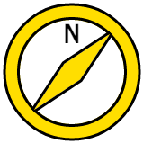
- Line Icon: A compass. (And yes the compass is pointing in the correct direction: since the needle always points north, if you’re heading northwest, this is what the compass should look like.)
- Emoji: 🧭

The Kate Shelley Line
(E, Union Pacific West)
- History: Kate Shelley has a prominent place in railroad folklore. An Irish immigrant living in Iowa in 1881, she overheard a C&NW inspection locomotive wreck into Honey Creek following a bridge washout during a round of severe thunderstorms. Since a passenger train was due through the area later that night, Kate ran through the storm to a nearby train station to alert railroad staff of the wreck. Her quick thinking saved the passenger train as well as two of the crew members from the initial wreck. C&NW would later run the Kate Shelley 400 over what’s now the Union Pacific West Line between Chicago and Iowa. It’s never a bad time to celebrate another brave woman in Midwestern history. (Plus Metra already officially uses “Kate Shelley Rose” as the color for the line.)
- Line Icon: A thunderstorm.
- Emoji: 🌩

The Marquette Line
(G, Milwaukee North)
- History: The Milwaukee Road ran the Marquette from Chicago to Madison and points west over what’s now the Milwaukee North (before the Illinois Tollway effectively killed demand for passenger rail service into Wisconsin).
- Line Icon: In honor of early Midwestern explorer Father Jacques Marquette, who cut through what’s now Chicago in 1673, this line uses a canoe.
- Emoji: 🛶

The Laker Line
(J, North Central Service)
- History: Metra’s service now operates over tracks controlled by Canadian National, but way back when, the Soo Line operated The Laker between Chicago and Duluth over this corridor (north of Franklin Park). Interestingly enough, the line between Franklin Park and downtown swung south and paralleled what’s now the Blue Line in Oak Park and Forest Park, which makes a fun corridor to discuss in the context of the O’Hare Express. “The Laker” is also a good name for this corridor since it cuts right up through the center of Lake County.
- Line Icon: A sailboat. Maybe on the nearby Chain O’Lakes.
- Emoji: ⛵️
The Arrow Line
(K, Milwaukee West)
- History: The Arrow was the Milwaukee Road’s Chicago-to-Omaha train, which operated over what’s now the Milwaukee West corridor. Metra calls the color “Arrow Yellow” after the train, but personally I feel like “yellow” is a bit misleading.
- Line Icon: I used a stylized arrowhead, pointing left (west) as a hat-tip to the current Milwaukee West name.
- Emoji: There’s no direct arrowhead emoji and I feel like one of the standard arrows is a little too, uh, direct… but there is a bow-and-arrow, so whatever, close enough. 🏹

The Western Star Line
(N, BNSF Railway)
- History: I really, really wanted to use the Zephyr here; the last version of the map that I posted in the last blog post still had the Zephyr listed. But, since this line does serve Union Station, and since Amtrak runs both the California Zephyr and the Illinois Zephyr over this same route, I unfortunately decided that it’d be too easy to confuse. I also considered the Mainstreeter, which is just a cool name for a train plus would be pretty representative of the small towns served by this Metra service, but I opted against it since there’s literally a “Main Street” station on this line (as well as one on a different line). That left the Western Star, a Burlington/Great Northern train that connected Chicago to Spokane via Glacier National Park. Plus, hey, a Star Line!
- Line Icon: Not Luxo. But close.
- Emoji: ⭐️

The Abraham Line
(P, Heritage Corridor)
- History: It’s nice when history is still current. The Alton Railroad began the Abraham Lincoln in 1935, and since then the operators have changed (from Alton to Gulf, Mobile and Ohio, and on to Amtrak) but the long-distance train keeps rolling today as Amtrak’s Lincoln Service. To distance the Metra line from the Amtrak service, I kept the Abraham and dropped the Lincoln.
- Line Icon: Lincoln’s trademark stovepipe hat. If regular Heritage Corridor riders prefer to see it as a tombstone, hey, go for it.
- Emoji: 🎩

The Blue Bird Line
(Q, SouthWest Service)
- History: The Wabash Railroad originally ran the Blue Bird (and the Banner Blue, which Metra uses as the color of the line) between Chicago and St. Louis via Decatur.
- Line Icon: It’s a bird’s head. Or at least it’s supposed to be a bird’s head. I’m not good with animals.
- Emoji: Another iPhone/Android conflict here: Apple’s bird emoji is actually blue (doesn’t look too dissimilar from my icon, actually); other emoji libraries use a bird that looks more like a cardinal here. When in doubt, add the blue ball in front. 🔵 🐦

The Rocket Line
(R, Rock Island – Main Line)
- History: When Amtrak was first formed in 1971, the government offered railroads a simple deal: pay a small fee and/or give Amtrak your passenger rolling stock to let Amtrak run passenger service, and in return the freight railroads would no longer be on the hook for providing (money-losing) passenger service. The Rock Island was one of six railroads that opted out of joining Amtrak, continuing to run their famed Rocket trains into the 1970s. In Chicago, the Peoria Rocket and the Des Moines Rocket (later the Quad Cities Rocket) operated over the Rock’s tracks between downtown and Joliet.
- Line Icon: A rocket, theoretically flying north-northeast from Blue Island to LaSalle Street Station.
- Emoji: 🚀

The Suburban Line
(S, Rock Island – Suburban Branch)
- History: Another freebie, the Suburban Line has been known as the Suburban Line (or Suburban Branch, depending on the source) since before the Great Chicago Fire. Since in our lettering scheme the Rock’s Rockets are R trains and the Suburbans are S trains, no need to get too deep in the weeds here.
- Line Icon: A single-family house. Picket fence and 2.3 kids not included.
- Emoji: 🏠

The Panama Line
(U, Metra Electric – Suburban Main)
- History: The most famous Illinois Central train that doesn’t have a song written about it, the Panama Limited was one of the most luxurious trains in the country, connecting Chicago and New Orleans over the Illinois Central’s main line. The original train was named after the Panama Canal, which was still being constructed when service first started.
- Line Icon: Since the train was named after the Panama Canal, the icon is a (very crude) container ship.
- Emoji: 🚢

The Magnolia Line
(V, Metra Electric – City Main/Blue Island Branch)
- History: The Panama Limited was one of the most luxurious trains in the country, with an all-sleeper consist. In 1967, as the Panama Limited was losing ridership (along with just about every other passenger train in the nation), the Illinois Central threw a few coach cars onto the Panama Limited and briefly called the coach accommodations the Magnolia Star, probably to try not to sully the luxurious reputation of the Panama Limited. I wonder if there’s some sort of allegory in there for how Metra treats suburban riders vs. city riders…
- Line Icon: A simplified magnolia bloom.
- Emoji: 🌺

The Diamond Line
(W, Metra Electric – South Chicago Branch)
- History: The Diamond represents a few different Illinois Central trains, including the Green Diamond, the Diamond Special, and the Night Diamond between Chicago and St. Louis. While the South Chicago Branch never hosted long-distance trains (for obvious reasons), these trains still share the old Illinois Central main line into downtown north of 63rd Street.
- Line Icon: A basic diamond on a teal background.
- Emoji: 💎
So what are your thoughts on the map? What should I change next year when I get restless about the map again? Go yell at me on Twitter. (P.S. – one of the most important things I did to this version of the map is format it to fit nicely on an 11×17 piece of paper. Here’s a PDF if you’d like to print it out at home or at work.)
One last quick plug for Transportation Camp: this Saturday, May 4 from 9am-5:30pm at the Chaddick Institute in DePaul’s Loop Campus (14 E. Jackson, 16th Floor). $30 for the day ($20 if you’re a student) is a bargain to nerd out all day long. Get registered over on YPT’s website.
3 thoughts on “Diverging Approach: Mayday”
Comments are closed.