
Editor’s Note, 1/22/20: The PABST Report has been updated with 2018 data, optimized for mobile use (with the Google Sheets app) and now features generated reports for each station. If you already know our methodology, feel free to go straight to the report.
Metra’s draft Station Evaluation Policy procedures are out, and Metra’s encouraging the public to review and comment on them by April 15. From Metra:
The policy establishes a plan to review existing stations at least every two years. Metra will collaborate with community stakeholders to create plans of action for stations with low ridership, in order to increase ridership, improve customer experience, and build support for Metra service among nearby residents. The policy also identifies a process for working with communities to address stations where ridership is not able to be improved.
In addition, the policy provides guidance for consideration of infill stations (that is, new stations on existing Metra lines, between existing stations). Proposals for new access points to the Metra system must weigh the potential benefits to new riders against drawbacks to existing riders, before they can proceed.
https://metrarail.com/node/6609
Metra taking a data-driven approach to analyze current levels of service and assessing their built assets (in this case, stations), is most certainly a good thing and fits in quite well with the Metra Board’s ongoing pursuit to run service as efficiently as possible despite a chronic lack of funding for operations and capital improvements.
Unfortunately, the draft plan as written leaves plenty to be desired. Metra’s triage method of analyzing stations relies on a single metric: weekday boardings. Regardless of how many trains a day serve each station, all the stations are measured against each other looking only at raw utilization. The first pass of the analysis is simply assuming the top half of all stations are “Sustainable”, whether that’s the thousands of people who board at Route 59 every day or the 410 boardings per day for the median station. The bottom half of stations are thus considered “Underperforming” by default, which means each station in the bottom half effectively needs some additional analyses to determine ways to boost ridership. While this will undoubtedly keep Metra’s planning staff (or Metra’s consultants) busy for each two-year cycle, it may be a little bit of overkill. Of course, the meat of the Station Evaluation Policy comes for the stations that fall in the bottom 10% of boardings, the “Unsustainable” stations. While the plan is ostensibly written as a way to boost ridership systemwide by performing deep-dive data analyses at Metra’s worst-performing stations, cynically it’s also easy to see how this overall plan will be used to simply produce a list of stations for the Board to cull.
I have three major issues with the “Unsustainable” stations. First and foremost, publicly branding a station as “Unsustainable” (or “Underperforming”, for that matter) could potentially be kryptonite for potential transit-oriented development projects, which is a bitter irony: TODs are potentially a great way to boost ridership at a station by creating newer, denser development within walking distance of the station, but it may scare a developer away if they think the station itself is threatened. Second, since “Unsustainable” is defined as the bottom ten percent of the system, there will always be a significant number of “Unsustainable” stations regardless of ridership levels. The assumption with this kind of system is that Metra inherently has too many stations, which may not actually be the case. In a worst-case scenario, with an iterative process that shuts down the bottom ten percent of stations every other year (an unlikely scenario, but not impossible), Metra could theoretically declare 80 of their 242 stations “Unsustainable” within the next decade.
And the third reason I’m not a fan of the “Unsustainable” branding is, well, when you map everything out, this process targets Chicago’s South Side with almost surgical precision. By relying on this mathematical method, Metra may be able to meet Title VI standards that are intended to prevent disporportionate negative impacts to majority-minority populations. (Stations that could potentially be slated for closure would still need to pass a Title VI analysis before the Board could vote to close those stations.)
I’m not accusing Metra of specifically targeting neighborhoods of color for service cuts, of course; half-mile spacing for rail stations through an urban area does not fit Metra’s commuter rail service model and invariably leads to waste regardless of the demographics of the neighborhoods served: more maintenance costs, longer travel times, and significant costs to bring these grade-separated stations up to Americans with Disabilities Act (ADA) standards. However, what I fear is that Metra will move to close and remove many of these South Side stations, which would significantly raise future costs if the Electric Line ever goes back to a more rapid transit-style service that the South Side sorely needs. (Two numbers to keep in the back of your mind when discussing a modernized Metra Electric service on the South Side: $2.3 billion, the CTA’s projected cost of extending the Red Line to 130th Street, and $931 million, Metra’s projected cost of the “Modern Metra Electric” alternative in the recent cost-benefit analysis. And if you really want to make yourself mad, check out these 1957 Illinois Central timetables that included 24-hour service and 20-minute off-peak headways on what’s now the Metra Electric.)
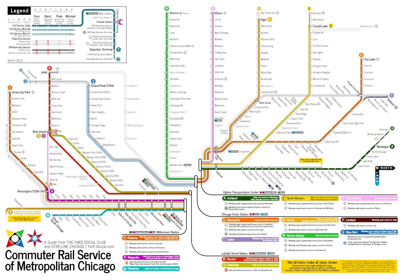
The “Chicago problem” is something this blog has discussed in the past: upwards of 70 of Metra’s 242 stations are within the City of Chicago, but the Metra Board is statutorily restricted to only a single member who lives in Chicago proper. Furthermore, the above map is a great example of why I tend to see how Metra operates their service differently than Metra’s official count of 11 lines: I consider Metra to operate no fewer than 14 distinct services, and it’s more effective to think of the Metra Electric in particular as three separate lines rather than a single operation: the Suburban Main Line, which operates similar to the rest of Metra’s suburban services; the City Main Line/Blue Island Branch, which has station spacing more similar to rapid transit service but operates with commuter rail headways (and fares); and the South Chicago Branch, which operationally is similar to the City Main/Blue Island Branch but is distinct for its mostly street-running operations down 71st Street and Exchange Avenue through a denser built environment. To help illustrate this, I went back and updated our infamous map. (A forthcoming blog post will dive deeper into the new map, but in the meantime, here’s a sneak peek.)
Back on topic for the Station Evaluation Policy: the draft also includes a recommendation for infill stations, which would require that any new infill station would have to be projected to make it into “Sustainable” (top half) station territory within the first decade the station is open, which seems unrealistic since none of Metra’s seven new/infill stations that opened in 2006 met that standard themselves. While it’s good that maybe Metra is trying to avoid the lackluster performance of these new stations, I worry that requiring a station to make it into the top 50% within a decade will require a massive coordinating development like Lincoln Yards or a massive sea of parking like the “Sustainable” 80th Avenue, Pingree Road, or Route 59 infill stations to meet those projections. (Of course, with Metra’s capital funding shortfalls, maybe that’s a feature of the analysis, not a bug.) It’s also worth noting that some of these recent infill stations were either poorly executed or victims of just bad luck: Rosemont was built in the middle of nowhere and lacks off-peak service for potential riders heading to the entertainment district; Schiller Park is more or less inaccessible from the east side of that community due to the existing rail yard in that location; Belmont Avenue is walking distance from the Franklin Park MD-W station, which sees significantly more service and is the first station served for peak-period expresses; the two SWS stations opened just in time for the housing bubble to cool off the Will County market; and so on.
| Station | Opening Year | 2016 Boardings | Draft Classification |
| Grand/Cicero MD-W | 2006 | 96 | Underperforming |
| Belmont Ave NCS | 2006 | 32 | Unsustainable |
| Schiller Park NCS | 2006 | 36 | Unsustainable |
| Rosemont NCS | 2006 | 35 | Unsustainable |
| Washington St/Grayslake NCS | 2006 | 110 | Underperforming |
| Laraway Road SWS | 2006 | 24 | Unsustainable |
| Manhattan SWS | 2006 | 22 | Unsustainable |
If you’re reading this, whether you agree with me or not, I encourage you to review the draft proposal yourself and shoot an email to Metra to let them know your thoughts — good or bad — before the April 15 deadline.
It’s been just about a year since this blog barged in with my two cents about the BNSF’s new Positive Train Control (PTC) schedule, wrote a letter to Metra about it, got my comments more or less dismissed, and observed the predictable shenanigans that followed last summer. I was going to do something similar this time around, but (1) I know there are a few people at Metra who read this blog anyway, and (2) if I’m going to give Metra some constructive criticism, I want to be able to offer up some justifiable, productive alternatives as well. So, as a self-appointed Blue Ribbon committee of one, I brainstormed what I’d want included above and beyond triaging the system based on boardings alone and seeing where the chips fell from there. I came up with five key performance indicators (KPIs) that I think should be used to give an easy, high-level assessment of each station:
- Parking. Since I know Metra historically hasn’t met a parking lot they didn’t like, I wanted the assessment to see how efficient parking is at each station that has it: does the station have an appropriate amount of parking or is the station overparked? How well are parking permits utilized, and can changes to parking lot management help improve the efficiency of existing parking lots to grow capacity without actually adding new hardscape?
- Accessibility. Is the station currently ADA-accessible? If not, would it be relatively easy to bring the station up to accessibility standards or would it require a significant investment?
- Boardings. Do a lot of riders use the station? Do more people board or alight at each station?
- Service. How many trains serve each station? Are the trains themselves relatively busy (which can increase dwell times and decrease service reliability), or is there a surplus of service, which suggests ridership issues at that station are not related to service levels?
- Trends. Is ridership increasing or decreasing at each station? While ridership decreases are obviously a more pressing issue, are there stations that have significantly gained ridership? Can we determine why ridership increased in those locations, and are there any lessons learned we can take away to apply to other stations for improvement?
Then I realized that all that data is already accessible (at least for 2016; still waiting on 2018 to get published) over on RTAMS. Instead of telling Metra what they should do, I could just do it myself.
Thus the PABST Blue Ribbon report was born. It’s nothing fancy: basically just a glorified spreadsheet that ranks each criteria on a 5-point scale for a quick and simple station assessment to provide a quick snapshot of each station. Go ahead: try it out for your station, and let’s talk about it over on Twitter. If you’d like the direct link to open it up on your own (or if the drop down menu isn’t working for you), check it out here. If you’re on a smartphone or tablet, make sure to download the Google Sheets app for best results. For a systemwide snapshot report, check out the “Scorecard” tab.
This report isn’t meant to make recommendations for station closures or station improvements (although in a few circumstances, a few standard recommendations will automatically pop up in the report), but rather a simple snapshot of KPIs to help guide conversations. So go ahead, play around with it (but try not to break it), and see how your station rates. And don’t forget to let Metra know your thoughts on the real Station Optimization project as well.
5 thoughts on “Diverging Approach: The Purge”
Comments are closed.